
Last updated: 5th May 2026
In an earlier post, I have explained how to create Google Pie charts using dynamic data from an SQL Server table. Now, here I am going to show you how to create Line charts or line graphs with Google Chart tools using dynamic JSON data or data extracted from an external JSON file.
🚀 Make Charts online using JSON data.
Use this tool to make charts effortlessly using JSON data.
• No programming required.
• You can make different charts/graphs like Pie (with 3D), Line, Column etc. by just entering data and the title of the chart.
• Once done, you can Print the graph/chart.
Google Chart tools provide simple methods, which allows developers to easily create interactive graphs using live data. You can get the data for your charts from various data source. Here, I’ll show you how easily you can extract data from an external or local JSON file and use the data to create a simple Line Chart.
There are two different methods for creating Line charts using Google Chart tools. You can use Google Core Charts method (the Classic mode or the old method) or the Material Line Charts method. I am sharing two separate examples here. The first example uses old Core charts version and the second example uses the new Material Charts version.
The JSON data
I’ll extract data from an external JSON file. Therefore, create a file in a folder and name it sample-sales.json (use any other name if you want). Add the below data to the file and save it.
[
    { "Month": "Jan", "Sales_Figure": 21, "Perc": 5 },
    { "Month": "Feb", "Sales_Figure": 32, "Perc": 15 },
    { "Month": "Mar", "Sales_Figure": 19, "Perc": 11 },
    { "Month": "Apr", "Sales_Figure": 8, "Perc": 17 },
    { "Month": "May", "Sales_Figure": 26, "Perc": 5 },
    { "Month": "Jun", "Sales_Figure": 31, "Perc": 2 },
    { "Month": "Jul", "Sales_Figure": 37, "Perc": 28 },
    { "Month": "Aug", "Sales_Figure": 16, "Perc": 14 },
    { "Month": "Sep", "Sales_Figure": 25, "Perc": 19 },
    { "Month": "Oct", "Sales_Figure": 30, "Perc": 8 }
]
Take a good look at the format above. The months are string values (in double quotes) and sale figures are integer values (with no quotes).
Add Charts Liberay
To create graphs/charts using Google charts tool, you will first have to add the chart library inside the <head> tag of your web page. Use the same library for both the versions. No matter how many charts you draw on a single page, you will have to add the loader (the loader.js) file only once in the beginning.
<script type="text/javascript" src="https://www.gstatic.com/charts/loader.js"></script>
You’ll now have access to all the methods and properties you will need to draw the charts.
Create Line Chart using Core Chart (Classic Mode)
The first example uses the older version called the Classic line chart and uses the corechart package.
<!DOCTYPE html>
<html>
<head>
    <script src="https://ajax.googleapis.com/ajax/libs/jquery/1.10.2/jquery.min.js"></script>
    <script type="text/javascript" src="https://www.gstatic.com/charts/loader.js"></script>
</head>
<body>
    <div id="chart" style="width:auto; height:300px;"></div>
</body>
<script>
    // Visualization API with the 'corechart' package.
    google.charts.load('visualization', { packages: ['corechart'] });
    google.charts.setOnLoadCallback(drawLineChart);

    function drawLineChart() {
        $.ajax({
            url: "https://www.encodedna.com/library/sample-sales.json",
            dataType: "json",
            type: "GET",
            contentType: "application/json; charset=utf-8",
            success: function (data) {
                // Define an array and assign columns for the chart.
                let arrSales = [['Month', 'Sales Figure', 'Perc. (%)']];

                // Loop through each data and populate the array.
                $.each(data, function (index, value) {
                    arrSales.push([value.Month, value.Sales_Figure, value.Perc]);
                });

                // Set chart Options.
                let options = {
                    title: 'Monthly Sales',
                    curveType: 'function',
                    legend: { position: 'bottom', textStyle: { color: '#555', fontSize: 14} }  // You can position the legend on 'top' or at the 'bottom'.
                };

                // Create DataTable and add the array to it.
                let figures = google.visualization.arrayToDataTable(arrSales)

                // Define the chart type (LineChart) and the container (a DIV in our case).
                let chart = new google.visualization.LineChart(document.getElementById('chart'));
                chart.draw(figures, options);      // Draw the chart with Options.
            },
            error: function (XMLHttpRequest, textStatus, errorThrown) {
                alert('Got an Error');
            }
        });
    }
</script>
</html>First, I am loading the Google Visualization API using google.charts.load method.
google.charts.load('visualization', { packages: ['corechart'] });
The method takes two parameters. The first is visualization that shows a beautiful graph on our web page.
The second parameter represents the package, an array with a list of visualization. In our example above, I am using the corechart package for displaying data.
Once the library is loaded, we will add data by creating a DataTable object. This object will hold the necessary data for making the graph. To ensure that the visualization API is fully loaded, we need to register a callback using the setOnLoadCallBack() method.
google.charts.setOnLoadCallback(drawLineChart);
The function drawLineChart() (its a user defined function) is where I am drawing the line chart. I am using jQuery Ajax to find and extract data from my JSON file. If it successfully finds the file (using the given path or URL), it will loop through each line of data and store it in an array.
arrSales.push([value.Month, value.Sales_Figure, value.Perc]);
Note: The first row in the array has the columns for the chart. Look how I have declared the array. Subsequent rows will have data.
var arrSales = [['Month', 'Sales Figure', 'Perc. (%)']];
Next, I am creating/defining a DataTable and adding the array to it.
var figures = google.visualization.arrayToDataTable(arrSales)
Finally, I’ll define the type of chart that it should draw.
var chart = new google.visualization.LineChart(document.getElementById('chart'));
The method LineChart() takes a parameter. It’s the container or element on my web page, where it will draw the chart. I have a <div> element inside the <body> tag with an id chart.
Now, draw the chart using all the data and few Options.
chart.draw(figures, options);
Now let us try the new version, the Material Line Chart.
Create Google Material Line Chart (Uses Material Design)
Let’s see how to create a Line chart using the Material Chart version.
<!DOCTYPE html>
<html>
<head>
    <script src="https://ajax.googleapis.com/ajax/libs/jquery/1.10.2/jquery.min.js"></script>
    <script type="text/javascript" src="https://www.gstatic.com/charts/loader.js"></script>
</head>

<body>
    <div id="chart" style="width:auto; height:300px;"></div>
</body>

<script>
    // Visualization API with the Line chart package.
    google.charts.load('current', { packages: ['line'] });
    google.charts.setOnLoadCallback(drawLineChart);

    function drawLineChart() {
        $.ajax({
            url: "https://www.encodedna.com/library/sample-sales.json",
            dataType: "json",
            type: "GET",
            contentType: "application/json; charset=utf-8",
            success: function (data) {
                var arrSales = [['Month', 'Sales Figure', 'Perc. (%)']];    // Define an array and assign columns for the chart.

                // Loop through each data and populate the array.
                $.each(data, function (index, value) {
                    arrSales.push([value.Month, value.Sales_Figure, value.Perc]);
                });

                // Set chart Options.
                var options = {
                    chart: {
                        title: 'Monthly Sales',
                        subtitle: '-- quantities sold'
                    },
                    axes: {
                        x: {
                            0: { side: 'top'}   // Use "top" or "bottom".
                        }
                    }
                };

                // Create DataTable and add the array to it.
                var figures = google.visualization.arrayToDataTable(arrSales)

                // Define the chart type (LineChart) and the container (a DIV in our case).
                var chart = new google.charts.Line(document.getElementById('chart'))

                // Draw the chart with Options.
                chart.draw(figures, google.charts.Line.convertOptions(options));
            },
            error: function (XMLHttpRequest, textStatus, errorThrown) {
                alert('Got an Error');
            }
        });
    }
</script>
</html>As you can see, the chart now looks different from the chart I have created in my first example. It looks neat and properly aligned (not too much left margin). However, there are no curves, and see where the legend (Sales Figure) is positioned, by default.
However, it has some new (useful) features.
👉 Create a Google Pie Chart using dynamic data and Web Service. 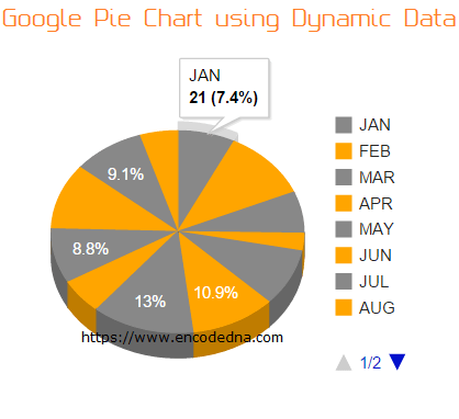
The data extraction part is the same like in the Classic version that I have explained in the first example. However, the API loading part is slightly different. Instead of corechart package, I am using line package.
google.charts.load('current', { packages: ['line'] });
Its very specific now. Since I am creating a Line chart, I’ll use the Line package.
Now look at the Options section. It has two new features called the subtitle and axes. Careful, how you spell it and use it. It is case sensitive.
I can now add a subtitle below the title. The axes.x option (available only in Material Charts version) allows developers to show the labels (in our case Month) on top or at the bottom. Its default value is bottom.

There are few more changes in the Material Line Charts version from its older/core version. Look how I’ve defined the chart type and finally drawing it.
var chart = new google.charts.Line(document.getElementById('chart'))
chart.draw(figures, google.charts.Line.convertOptions(options));
There are many new features in the Google Material Charts version that you can use to create some nice and interactive charts using live data. For now, this is it.
• There is one problem though. If you see both the examples, the first example uses an option called the legend (the object showing the text "Sales Figure"), which allowed me to position the legend either top or bottom. This option is missing in the new Material Line Charts version (when I wrote this post).
Related articles
• How to Show Percentage and Values together in Google Pie Charts
• How to make Google Donut (Pie) Chart using Dynamic data and Web API
• How to create Column Charts using Highcharts API using data from external JSON file