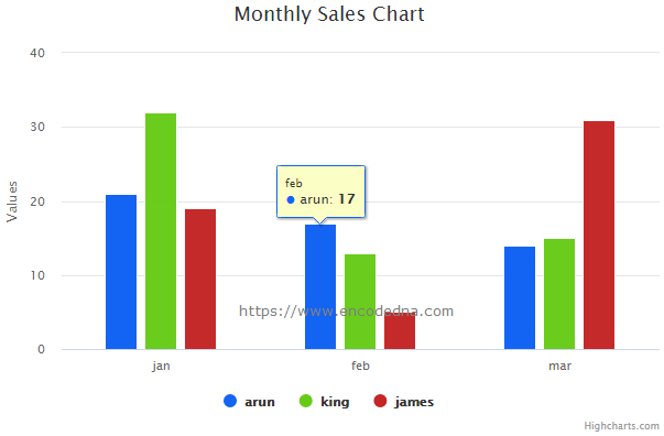
I recently used Highcharts API in an application and thought I should share few tips with my blog readers here.
Highcharts take data from JavaScript arrays. Therefore, it is easy to use JSON data stored in an external file. You can easily extract data from a JSON file in JavaScript, store the data into an array and use it for creating charts.
The JSON data for my Chart
The JSON data look like this.
[
    { "name": "arun", "data": [21, 17, 14] },
    { "name": "king", "data": [32, 13, 15] },
    { "name": "james", "data": [19, 5, 31] }
]Always remember, that JSON strings must me written in "double quotes". Do not use single quotes, else it will throw an error while extracting the data using Ajax.
"Notice the two common strings in the array: 'name' and 'data.' The 'name' key holds different agent (or salesperson) names, while 'data' contains integer values enclosed in square brackets []. These integers represent sales figures for various months.
Note: Don’t change the strings name and data in the JSON. Change the values. Since I’ll be providing data (as array) to the Highcharts using the series object.
Now, save the data in a file named sales.json (or any other name).
➡️ You can also create "dynamic" charts using Google Charts API with JSON. No coding experience required.
I am not using jQuery or any other library here. It’s a pure JavaScript example.
However to work with Highcharts API, you’ll need to add few libraries to your applications. There are two ways to do this. Download Highcharts API and install it or you can use Highchart CDN.
I am using Highcharts CDN for my example here. It’s easy to use and you can access it from anywhere around the world. It loads fast.
Add the CDN inside the <head> tag in your web page.
<!DOCTYPE html>
<html>
<head>
    <title>Column Charts example using HighCharts API</title>
    <script src="https://code.highcharts.com/highcharts.js"></script>
</head>
<body>
    <div id="container" style="min-width: 310px; height: 400px; margin: 0 auto;"></div>
</body>

<script>
    // JavaScript Ajax to connect and get data from External file.
    const oXHR = new XMLHttpRequest();          // Create XMLHttpRequest object.

    // Initiate request.
    oXHR.onreadystatechange = function () {
        if (oXHR.readyState == 4) {		        // Check if request is complete.
            createChart(this.responseText);     // Create the chart with JSON data.
        }
    };
    oXHR.open("GET", "highch_sales.json", true);  // get json file.
    oXHR.send();

    // Create the chart.
    let createChart = (jsonData) => {

        let arrSales = [];
        arrSales = JSON.parse(jsonData); 	// Convert JSON to array.

        Highcharts.chart('container', {
            chart: {
                type: 'column'
            },

            xAxis: {		// the 'x' axis or 'category' axis.
                categories: ['jan', 'feb', 'mar']
            },

            title: {
                text: 'Monthly Sales Chart'
            },

            series: arrSales,

            colors: ['#1464F4', 'rgb(102,203,22)', '#c42525'],

            tooltip: {
                backgroundColor: '#FCFFC5'
            }
        });
    }
</script>
</html>Inside the <body> section, I have a <div> element on which I’ll show the chart.
Next, I am using JavaScript Ajax to connect with the JSON file. Once the connection is made, I am calling a function named createChart() with the JSON data. It’s where I am creating the chart.
As I said in the beginning, Highcharts take data from arrays. Therefore, I am converting the JSON to an array.
let arrSales = [];
arrSales = JSON.parse(jsonData);
Chart Type
I have mentioned the chart type as column here using the chart property,
chart: {
    type: 'column'
},
You can change the chart type to line or bar and even pie. This is as per your requirement. I was little uncomfortable with the pie chart in this data format.
Remember: The default chart type is line. It means, if you ignore the charts property completely, it will show a line chart by default. So, you have to explicitly define your chart type.
Now, try these charts types too. Like the spline, areaspline and the scatter. You can create some beautiful and interactive charts.
xAxis property (Also called the Category Axis)
The xAxis is an important option here. It also denotes the category axis.
xAxis: {
    categories: ['jan', 'feb', 'mar']
},
The categories are jan, feb and mar. It’s the months of a year. Now, see the JSON file again. I have a “data” string, which has data (numeric values) inside the square braces []. Those are sales numbers (or figures) for a particular month (that is jan, feb and mar).
Note: You can see the categories below the columns in the chart.
title Object
It has a title option where you can add a title for your chart.
title: {
    text: 'Monthly Sales Chart'
},
series Object
Here goes our data.
series: arrSales,
A series is set a data and it takes an array. The data for the chart is in an array named arrSales, which I am providing it to the series object.
The structure of the series object may look like this.
series: [{
    name: '', data: []
}]
The data inside the JSON file (see above) is in this structure. The name is the name of the series. The data in the series is an array of data.
color Object
The color object, followed by the tooltip object is optional. Using the color object, you can show the columns (or the chart) using custom colours (colour of your choice). You can use hash, rgb() or just colour names (like red etc.)
colors: ['#1464F4', 'rgb(102,203,22)', '#c42525'],
If you ignore the color object, Highchart will use default colours.
tooltip object
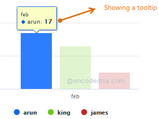
Highcharts will show a tooltip when you hover the mouse over a series.

You can add a custom tooltip in your charts using the tooltip object.
tooltip: {
    backgroundColor: '#FCFFC5'
}
Change the border colour and radius of the tooltip like this.
tooltip: {
	borderColor: #ff0,
	borderRadius: 3
}Note: Just be careful with commas and cases (the lower and upper cases).
Well, that’s it. Design your charts using Highcharts.
1) It's easy to use.
2) It's convenient.
3) It's pure JavaScript.
4) You can use dynamic data for the charts (like extracting data from a JSON file).
5) And most importantly, it’s free (as long as you are not using the Highcharts API for commercial purpose).
➡️ See the charts section for more examples.
Export HighChart
You can export charts created using HighCharts to an image file or export the data to Excel etc. All you have to do is, just include the Export Modules inside the HEAD tag in your web page.
Once you add the Export Modules, it will show a Chart Context Menu at the right top of the chart.
<head>
    <script src="https://code.highcharts.com/highcharts.js"></script>

    <script src="https://code.highcharts.com/modules/exporting.js"></script>
    <script src="https://code.highcharts.com/modules/export-data.js"></script>
</head>Make Charts online using our Graph Maker:
From raw JSON data, you can make various charts (or graphs) like pie chart, line chart, column chart etc. dynamically using this simple tool.
Turn raw JSON data into meaningful charts.
Try the Graph Maker ➪
