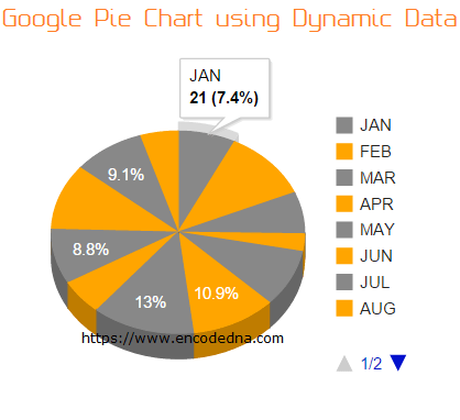
Do you know you can create charts dynamically with Google Charts API? Check out this article on How to create dynamic Google Donut (Pie) Chart with data extracted from SQL Serer table using Wep API
In one of my earlier posts, I have shown how to create interactive Google Pie Charts using static data, such as, an array. However, in real time scenarios, you’ll required to create graphs or charts using live data. So, let's see how we can create a dynamic Pie Chart with Google Charts Tool using dynamic data. The data will be extracted from an SQL Server database table using jQuery Ajax and Asp.Net webservice.
Before we start building our web page, we need to create our SQL Server table. Here I have a table called dbo.Books_Annual_Sales, which stores monthly sales of Books, that is, the number of units sold every month. First, create the table and add few rows to it.
CREATE TABLE dbo.Books_Annual_Sales(
    Month varchar(50) NULL,
    SalesFigure int NULL
) ON PRIMARY
The table has two columns, the “Month” and “SalesFigure”.
In the <head> section, I have included two links one for the jQuery API and second the Google charts API. Both the links provide us with the necessary functions. Inside the <body> section, I have only added a DIV element, which serves as a container.
<!DOCTYPE html>
<html>
<head>
    <title>Google Charts Example with Dynamica Data</title>
    <script src="https://ajax.googleapis.com/ajax/libs/jquery/1.10.2/jquery.min.js"></script>
    <script type="text/javascript" src="https://www.google.com/jsapi"></script>
</head>
<body>
    <div id="b_sale" style="width:500px; height:300px;"></div>
</body>
<script>
    // VISUALIZATION API AND THE PIE CHART PACKAGE.
    google.load("visualization", "1", { packages: ["corechart"] });
    google.setOnLoadCallback(createPIE);

    function createPIE() {
        // SET CHART OPTIONS.
        var options = {
            title: 'Monthly sale of Books',
            colors: ['#888', 'orange'],
            is3D: true
        };

        $.ajax({
            url: "WebService.asmx/Annual_Sales",
            dataType: "json",
            type: "POST",
            contentType: "application/json; charset=utf-8",
            success: function (data) {
                var arrValues = [['Month', 'Sales Figure']];        // DEFINE AN ARRAY.
                var iCnt = 0;

                $.each(data.d, function () {
                    // POPULATE ARRAY WITH THE EXTRACTED DATA.
                    arrValues.push([data.d[iCnt].Month, data.d[iCnt].SalesFigure]);
                    iCnt += 1;
                });

                // CREATE A DataTable AND ADD THE ARRAY (WITH DATA) IN IT.
                var figures = google.visualization.arrayToDataTable(arrValues)

                // THE TYPE OF CHART (PieChart IN THIS EXAMPLE).
                var chart = new google.visualization.PieChart(document.getElementById('b_sale'));

                chart.draw(figures, options);      // DRAW GRAPH WITH THE DATA AND OPTIONS.
            },
            error: function (XMLHttpRequest, textStatus, errorThrown) {
                alert('Got an Error');
            }
        });
    }
</script>
</html>
We will load visualization using google.load() method with its three parameters.
1) visualization: It provides the chart.
2) version: The version of the API and its set to “1”.
3) package: The package is an array with a list of “visualization” (chart properties). I have defined the corechart package for the Pie chart.
I have also set few properties as options, such as, the title for the chart, defined two different colors to highlight the figures differently. Finally, I want the Pie chart to be three-dimensional.
var options = {
    title: 'Monthly sale of Books',
    colors: ['#888', 'orange'],
    is3D: true
};
You may remove one or all the options and see the result.
In the Ajax section, I have added the necessary properties for extracting the data from a remote machine. I am using a typical web service for data extraction using JSON.
url: "WebService.asmx/Annual_Sales",
Once extracted, I’ll store the data in an Array and later deliver the data to the Google API for the graph. I have explained clearly about each Google chart API method that I have used in this example in my previous article here. Don't miss the article, as I have explained the methods step by step, as it very important to understand how Google Charts work.
Create a DataTable object using Google Chart arrayToDataTable() Method
using System;
using System.Collections.Generic;
using System.Linq;
using System.Web;
using System.Web.Services;
using System.Data.SqlClient;

[System.Web.Script.Services.ScriptService()]
public class WebService : System.Web.Services.WebService
{
    public class Sales_Figures
    {
        public string Month;
        public int SalesFigure;
    }

    [WebMethod]
    public List<Sales_Figures> Annual_Sales()
    {
        List<Sales_Figures> lstSales = new List<Sales_Figures>();

        string sConnString = "Data Source=DNA;Persist Security Info=False;" +
            "Initial Catalog=DNA_Classified;User Id=sa;Password=;Connect Timeout=30;";

        SqlConnection myConn = new SqlConnection(sConnString);
        SqlCommand objComm = new SqlCommand("SELECT *FROM dbo.Books_Annual_Sales ", myConn);
        myConn.Open();

        SqlDataReader sdr = objComm.ExecuteReader();

        while (sdr.Read())
        {
            Sales_Figures objValues = new Sales_Figures();
            objValues.Month = sdr["Month"].ToString();
            objValues.SalesFigure = (int)sdr["SalesFigure"];

            lstSales.Add(objValues);
        }

        myConn.Close();
        sdr.Close();
        return lstSales;
    }
}
Imports System.Web
Imports System.Web.Services
Imports System.Web.Services.Protocols

Imports System.Data.SqlClient

<System.Web.Script.Services.ScriptService()> _
Public Class WebService
    Inherits System.Web.Services.WebService

    Public Class Sales_Figures
        Public Month As String
        Public SalesFigure As Integer
    End Class

    <WebMethod()> _
    Public Function Annual_Sales() As List(Of Sales_Figures)
        Dim lstSales As New List(Of Sales_Figures)()

        Dim sConnString As String = "Data Source=DNA;Persist Security Info=False;" & _
            "Initial Catalog=DNA_Classified;User Id=sa;Password=;Connect Timeout=30;"

        Dim myConn As New SqlConnection(sConnString)
        Dim objComm As New SqlCommand("SELECT *FROM dbo.Books_Annual_Sales ", myConn)
        myConn.Open()

        Dim sdr As SqlDataReader = objComm.ExecuteReader()

        While sdr.Read
            Dim objValues As New Sales_Figures()
            objValues.Month = sdr("Month").ToString()
            objValues.SalesFigure = sdr("SalesFigure")

            lstSales.Add(objValues)
        End While

        myConn.Close() : sdr.Close() : Return lstSales
    End Function
End Class