Click to enlarge the image!
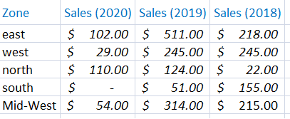
The data structure on my worksheet. It has 3 years of sales data (approx) for different zones. I’ll create line chart taking all the 3 years data, with click of a button.

The code is simple. I have procedure named lineChart, which is called when someone clicks the button on the worksheet.
Option Explicit

Private Sub CommandButton1_Click()
    lineChart
End Sub

Sub lineChart()

    Dim src As Worksheet
    Set src = Worksheets("sheet1")      ' Sheet1 data.

    Dim oChart As ChartObject      ' Create an object, a Chart object.

    ' First, delete all previous chart (if any). We'll create chart with new data.
    For Each oChart In src.ChartObjects
        oChart.Delete
    Next

    ' Create an array of columns with data (for the charts)
    Dim aRng() As String
    ReDim aRng(1 To 4)

    aRng(1) = "B2"
    aRng(2) = "C2"
    aRng(3) = "D2"

    ' Create chart object and series.
    Dim objLineChart As New Chart
    Dim oSeries As Series          ' Ref: https://msdn.microsoft.com/en-us/vba/excel-vba/articles/series-object-excel

    Dim iCnt, ileft As Integer
    ileft = 5         ' Initial postion of the first chart.

    ' Loop through each range.
    For iCnt = LBound(aRng) To UBound(aRng) - 1

        ' Create a chart with location and size (width and height)
        Set objLineChart = src.ChartObjects.Add( _
            Width:=250, Height:=200, Top:=170, left:=ileft).Chart

        ' Define chart properties.
        With objLineChart
            .ChartType = xlLine     ' Define chart type.

            .HasTitle = True            ' Should it have a Title? (The default value is "false".)
            ' If the chart has a "title", name it using the "column" name (any other name).
            .ChartTitle.Text = src.UsedRange.Rows.Cells(1, iCnt + 1)

            ' Define series properties.
            Set oSeries = .SeriesCollection.NewSeries
            With oSeries
                .XValues = src.Range(src.Range("A2"), src.Range("A2").End(xlDown))
                .Values = src.Range(src.Range(aRng(iCnt)), src.Range(aRng(iCnt)).End(xlDown))

                .MarkerBackgroundColor = RGB(255, 0, 0)
                .MarkerForegroundColor = RGB(255, 0, 0)
                .MarkerSize = 5
                .MarkerStyle = xlMarkerStyleCircle    ' Default style is "Diamond".
            End With

            .SeriesCollection(1).HasDataLabels = True      ' Turn data labels for the Series.

        End With

        ileft = ileft + 253    ' Go to the next location for a new chart (Calculated based on Chart Width).
    Next iCnt
End Sub
First, I am creating a ChartObject.
Dim oChart As ChartObject
I need to clear previous charts (if any) on my worksheet. So, whenever someone clicks the button, it gets fresh data from the worksheet and a creates a new chart for a particular range. You can further automate the process by using a timer to the procedure, or when you anyone opens the workbook.
Next, I’ve created an array of columns with data.
Dim aRng() As String
ReDim aRng(1 To 4)

aRng(1) = "B2"
aRng(2) = "C2"
aRng(3) = "D2"Note: If you have more columns to create more charts, simply redim the array and assign columns to the array.
Finally, I have created the line chart object and series object. Now, I have access to the methods and properties to design the charts, add colour to the markers, add a title etc.
It loops through each range, extracts data from each column and row and designs the chart.
See this piece of code.
Set objLineChart = src.ChartObjects.Add( _
Width:=250, Height:=200, Top:=170, left:=ileft).Chart
Its here I am designing the chart by setting its width, height and location (top and left) where it will be positioned in my worksheet.
Similarly, you can create other chart types, like a Pie chart, easily with the click of a button. It is simple. You can write once and with little changes in the code, you can easily create beautiful dynamic charts in Excel.
👉 Do you know you can easily export multiple charts from your Excel worksheet to PowerPoint? See this example.
Make Charts online using our Graph Maker:
From raw JSON data, you can make various charts (or graphs) like pie chart, donut chart, line chart, column chart etc. dynamically using this simple tool.
Turn raw JSON data into meaningful charts.
Try the Graph Maker ➪
