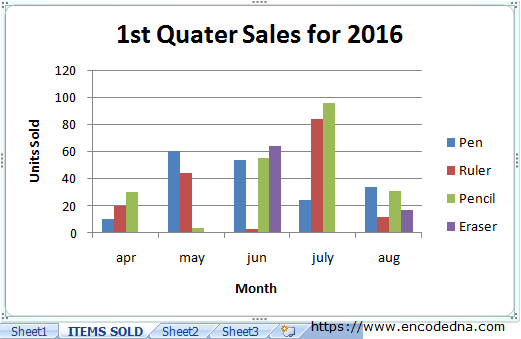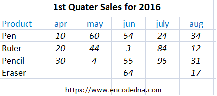
The Data in My Worksheet
Here’s a simple data structure on my worksheet. It shows quarterly sales report of stationeries for a particular year. It has few columns showing the list of products along with number units sold for each month. I also have a heading on top, showing the year and quarter for sales.

The heading of the worksheet is also important, as I am going dynamically pick up the heading using a formula and add it to the chart (as heading). I may have various other headings, with different set of data, on my worksheet and a using similar formula, read and add the headings to other charts.
Along the data on my worksheet, I’ll add a button. Its an ActiveX control, which you can add from the Developer tab in Excel. The button’s click event will call a function in VBA that will create the chart.
Option Explicit

Private Sub CommandButton1_Click()
    createSalesChart
End Sub

Sub createSalesChart()
On Error GoTo ErrHandler
    Dim salesChart As New Chart
    Set salesChart = Charts.Add(After:=Worksheets("Sheet1"))

    With salesChart

        ' THE SOURCE (OR DATA) FOR THE CHART.
            ' HERE ITS "Sheet1" FOR THE RANGE "A3 TO F7".
        .SetSourceData _
            Source:=Sheets("Sheet1").Range("A3:F7"), _
            PlotBy:=xlRows

        ' THE LOCATION (AS NEW SHEET) AND NAME OF THE SHEET.
        .Location Where:=xlLocationAsNewSheet, _
            Name:="ITEMS SOLD"

        .ChartType = xlColumnClustered      ' THE TYPE OF CHART.

        ' SET THE CHART SIZE.
        .ChartArea.Width = 500
        .ChartArea.Height = 350

        ' ADD A TITLE TO THE CHART, USING A FORMULA.
        .HasTitle = True
        .ChartTitle.Text = "=Sheet1!R1C1"

        .Axes(xlCategory, xlPrimary).HasTitle = True
        .Axes(xlCategory, xlPrimary).AxisTitle.Characters.Text = "Month"

        .Axes(xlValue, xlPrimary).HasTitle = True
        .Axes(xlValue, xlPrimary).AxisTitle.Characters.Text = "Units Sold"
    End With
ErrHandler:
    '
End Sub
The Chart Class
Inside the above function, I am first create an object of the class Chart. It represents a chart in your workbook. This class provides the necessary methods and properties to create and add chart, with various Axis etc. I can now add a chart in a separate sheet in my workbook. See .Location method in the above code.
The Charts Class with Add() Method
Next, I am setting (or initializing) the object by adding a chart using the Charts.Add() method. The Charts class provides a collection of chart sheets in your active workbook. The add() method takes four parameters. However, I have added just one, asking it to add the chart sheet after Sheet1 (its where the data is).
Set salesChart = Charts.Add(After:=Worksheets("Sheet1"))
Therefore, now after you click the button, Excel will automatically create the Chart and add the chart to a new sheet after Sheet1. By default, it will add the newly created sheet before sheet1.

.SetSourceData() Method
Using this method, I am providing the source of data to my chart. That is the sheet where I have the data and a range.
.SetSourceData _
    Source:=Sheets("Sheet1").Range("A3:F7"), _
    PlotBy:=xlRows
The above method takes two parameters.
Source: It’s a required parameter. Define the range of data.
PlotBy: Specifies the way the data is to be plotted. It is either xlRows or xlColumns.
I may have various other data in different ranges. In my example, I want it pick data from range A3 to F7. As and when data and columns increase, I have to re-define the range in my Macro. Alternatively, you can define a larger range if you are expecting it.
.Location() Method
Using this method, you can move the chart to a different location (or sheet). I can also provide a name to newly created sheet. If you do not provide any name, Excel will create a new sheet with names such as chart1 or chart2 etc.
.Location Where:=xlLocationAsNewSheet, _
    Name:="ITEMS SOLD"
The method takes two parameters.
Where: Where you want Excel to move your chart (Here are other options). This parameter in required
Name: It’s an optional parameter. You can provide a name to the sheet with the chart. This is useful if you have many sheets on your workbook.
.ChartType Property
This property provides you with some very interesting and useful types of charts.
.ChartType = xlColumnClustered
Simply type xl and press Ctrl+space keys and you will get a list of various charts to experiment. Chart like, xlColumnClustered, xlPie and xlConeBarClustered are my favorite in the list of others.
Chart Size
You can control the size of your charts by simply defining the width and height of the charts.
.ChartArea.Width = 500
.ChartArea.Height = 350
Dynamically Add Title (Header) to Excel Chart using Formula
To add a title to a specified chart, you can use the ChartTitle property. However, first you have to set the HasTitle property as True.
.HasTitle = True
.ChartTitle.Text = "1st Quarter Sales"
In my VBA code above, I have defined a value for the title dynamically using a Formula.
.ChartTitle.Text = "=Sheet1!R1C1"
Well that's it. Hope you like this article and example. I know its very useful for creating dynamic charts in Excel. I have tried to keep the VBA code simple. However, you can add many more functions in your code and in the future, I’ll share more useful Chart examples here in my blog.
