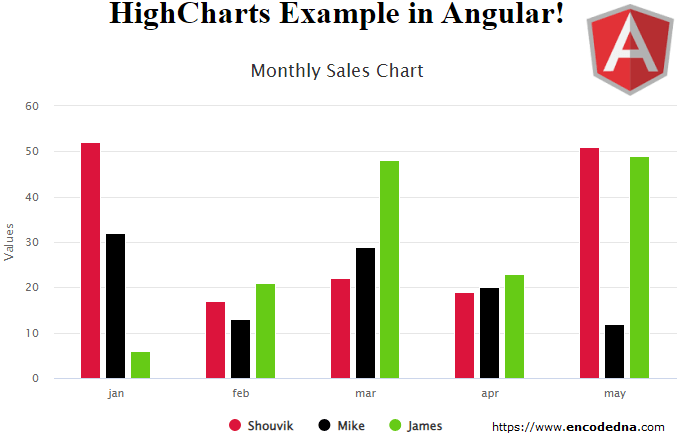
See the above image. It’s a column chart created using HighCharts in Angular 6. The chart is interactive and responsive.
• When I say interactive, it means you can hover over a marker to get a tooltip, click a name or value to see individual detail etc.
• The charts are responsive, which means you can comfortably view or share the charts on any device such as mobile, a tab or a desktop device.
Let’s create a chart.
You have to create an application using Angular Command Line Interface or the CLI. Open the command prompt and go to the folder where you want to create the project.
ng new angularHighChart
Go to the folder…
cd angularHighChart
and launch the server…
ng serve --o
Install HighChart Library
Next, install the library via command line.
npm install highcharts
Have patience, it will take some time (depending upon your internet speed) to download and install HighCharts.
Once installed, you can find the HighCharts folder inside node_modules.
Create the Chart Component (Integrate HighCharts)
Now let’s create the application component and import the HighCharts library. You’ll have access to all the properties, options and methods to create animated and interactive charts.
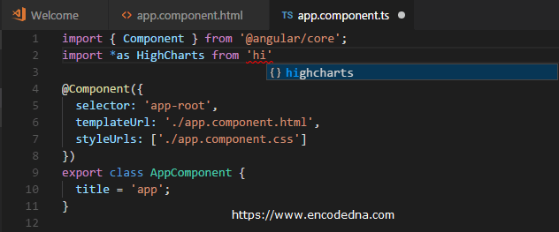
Open the app.component.ts file and write the below code in it.
import { Component, OnInit } from '@angular/core';
import * as Highcharts from 'highcharts'        // import highcharts library

@Component({
  selector: 'app-root',
  templateUrl: './app.component.html',
  styleUrls: ['./app.component.css']
})
export class AppComponent {
  title = 'HighCharts Example in Angular';

  constructor () { console.log ('Hi') }

  public chartOptions: any = {
    chart: {
      type: 'column'
    },

    xAxis: {    // the 'x' axis or 'category' axis.
        categories: ['jan', 'feb', 'mar', 'apr', 'may']
    },

    title: {
        text: 'Monthly Sales Chart'
    },

    series: [
      { "name": "Shouvik", "data": [52, 17, 22, 19, 51] },
      { "name": "Mike", "data": [32, 13, 29, 20, 12] },
      { "name": "James", "data": [6, 21, 48, 23, 49] }
    ],

    colors: ['crimson','#000', 'rgb(102,203,22)'],

    tooltip: {
        backgroundColor: '#FCFFC5'
    }
  }

  ngOnInit () {
    Highcharts.chart('div-container', this.chartOptions)
  }
}
See at the 2nd line of the above code. Its where I am importing the HighCharts library.

Next, I have defined few options for the chart inside a Public property.
public chartOptions: any = { ... }
The library that we have integrated, provides all the option and there many more.
Here are options:
• Chart Type: I have mentioned the chart type as column.
chart: {
    type: 'column'
},
You can change the chart type to line, bar or pie.
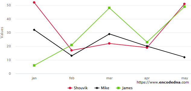
Remember: The default chart type is line. It means, if you ignore the charts type, it will show a line chart by default. So, you have to explicitly define your chart type. Or else, it will look like ths.

Now, try other charts too. Like the spline, areaspline and the scatter. You can create some beautiful and interactive charts.
• xAxis property (Also called the Category Axis): The xAxis is an important option here. It also denotes the category axis.
xAxis: {
    categories: ['jan', 'feb', 'mar', 'apr', 'may']
},
The categories are jan, feb, mar, apr and may. It’s the month of a year.
Note: You can see the categories just below the columns in the chart.
• title Object: It has a title option where you can add a title for your chart.
title: {
    text: 'Monthly Sales Chart'
},
• series Object: This is our data. The data in the above example is a static data, that its a hardcoded JSON array. The array has two objects, name and data. The data is for the xAxis.
We can provide dynamic data to the charts, data that can be extracted from an External JSON file or using an API to extract data from a database like SQL Server.
Finally, I am using ngOnInit() method, which will draw the chart inside a <div> element using the chart option and the data. The function chart() takes two parameters. A container (or an HTML element) to show the chart and a chart options property.
ngOnInit () {
    Highcharts.chart('div-container', this.chartOptions)
}
This is the final step. We have to create a template, where we’ll add a <div> element to show the chart.
Open app.compontent.html and write the below markup.
<div style="text-align:center; width: 700px">
  <h1>
    {{ title }}!
  </h1>
</div>

<div id="div-container" style="width: 700px;"></div>
That’s it. Now run the application.
ng serve --o
If everything works fine, you will see a column chart with the hardcoded data.
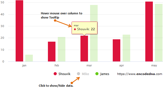
• Hover the mouse over the columns to see a tooltip.
• Click the names to show or hide to view a particular set of data on the chart. See when I clicked Mike, its disabled and it hides the data of Mike and shows the remaining two (in red and green). 👇

HighCharts are easy to use. Just few steps and you’ll see interactive charts on your web page. Its pure JavaScript. You can use dynamic data for the charts. My next post is about using dynamic data for HighCharts in Angular.
