Last Updated: 06th May 2025
A chart visually represents data, making it easier to understand trends and comparisons. A Pie chart, specifically, is a circular chart that divides data into slices, with each slice representing a proportion of the whole. In this guide, I’ll walk you through the step-by-step process of creating Pie charts in Excel using your worksheet data, helping you visualize and analyze information more effectively.I have shared two different examples.
The Data
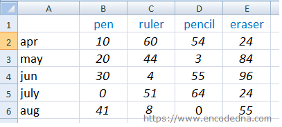
The worksheet displayed below 👇contains structured data with four columns and five rows on Sheet1. It presents figures, such as, sales data for multiple products. Each column represents a distinct product, while each row details the monthly units sold, offering a clear view of product performance over time.
Now, let’s see how we can create Pie charts using the above data.
1) First Example
In this first example, I’ll demonstrate how to create a Pie chart to visualize product sales for April. This chart will clearly show the distribution of items sold, such as Pens, Rulers, and more. Follow these simple steps to generate a visually informative Pie chart in Excel.
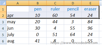
1) First, select the data for the chart as shown in the image below.
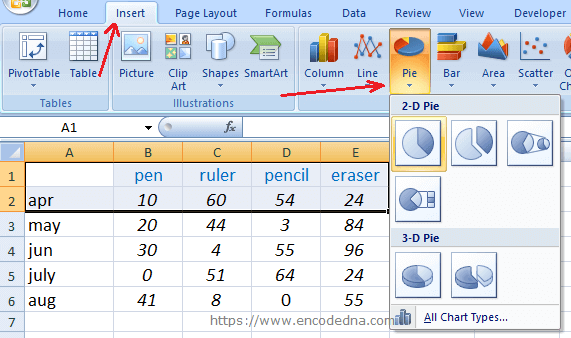
2) Next, from the "top" menu in your Excel workbook, select the "Insert" tab. You will see a list of chart types. Click the Pie option and choose a type, either "2D" or "3D", depending on your requirement.
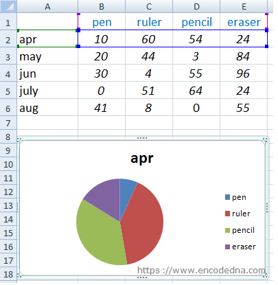
Your chart for the selected data is now ready.
Likewise, you can create an additional Pie chart to visualize sales data for "May" across all products. This time, you’ll need to select rows separately using a combination of mouse and keyboard actions. First, use the mouse to highlight the first row up to the last column. Then, press and hold the Ctrl key, refocus on the third row and drag to the last column. This technique allows you to customize data selection efficiently for precise chart generation.
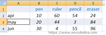
Again, choose the "Pie chart" from the top menu (as I have mentioned earlier). Repeat the process for all the rows and you have multiple Pie charts on sheet1.
2) Second Example
Using the same data structure, you can generate product-wise Pie charts to visualize sales performance. In the previous example (the 1st example above), Pie charts were created for different months. However, if you wish to analyze the number of sales for each product (e.g., pens, rulers, etc.) across all months, you should use vertical selection.
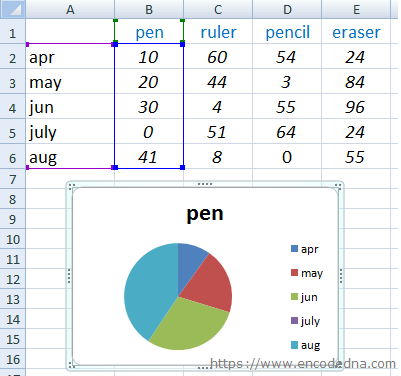
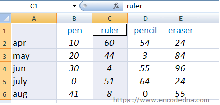
Similarly, you can create another chart by select the next columns (e.g., ruler) along with the first column.
1) Click on the first column's first row, then drag the mouse down to the last row.
2) Hold the Ctrl key, click on the third column (ruler), and drag down until the last row.
There are other features associated with the Pie chart, which you can use to enhance user experience.
Separate a Pie Chart Slice
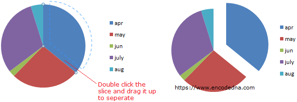
You can separate a Pie chart slice (or all the slices). Double click a particular slice, hold and drag it out to separate it from the other slices. You can use this option to analyze the data.
Add or Remove Data Labels to a Pie Chart (Excel 2007)
Data labels are data (or figures) associated with each slice. The data labels make a chart easier to understand. When you insert a Pie chart on your worksheet, it will show different slices, a title and a legend, without the data labels. This is the default behavior. You will have to add or remove Data labels on your own.
Now, see the below image again. It shows the slices, the title and the legend (apr, may etc.). The slices are the figures or the units sold (10, 20, 30 etc.). Without the data labels it is difficult to understand what each slice indicates.

Add Data labels to the chart...
1) Move the mouse over the chart for which you want to add data labels.
2) Right click the chart. It will show a small popup box. Choose the option Add Data Labels.
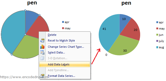
3) You can data label to a single slice. Simply double click the slice for which you want to add labels and repeat steps 1 and 2.
Note: Data labels will update automatically when you change the figures in your worksheet.
Remove Data labels from the chart...
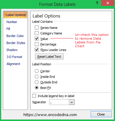
1) Right click the chart for which you want to remove data labels. It will show a small popup box.
2) Choose option Format Data Labels. It will open another box (window) with many options.
3) Close the window.
Make Charts online using our Graph Maker:
From raw JSON data, you can make various charts (or graphs) like pie chart, line chart, column chart etc. dynamically using this simple tool.
Turn raw JSON data into meaningful charts.
Try the Graph Maker ➪
