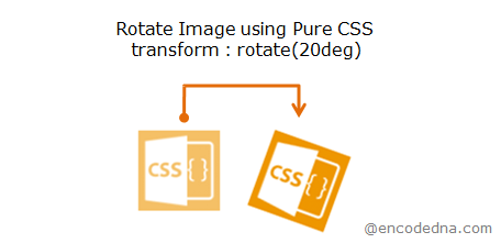
Syntax of "transform" property
transform: rotate(angle)
The transform property uses "different values" to perform different tasks like rotating, skewing, scaling, translating and moving etc. Some of its common values are rotate, scale, translate, skew and matrix.
Rotate image 20 degrees using CSS
In this example, I’ll use the rotate() function to rotate an image.
<style>
    img {
        transform: rotate(20deg);
        -ms-transform: rotate(20deg);
        -webkit-transform: rotate(20deg);

        border: none;
    }
</style>
</head>
<body>
    <div>
        <img src='../../images/theme/css.png'>
    </div>
</body>The above example rotates an image at a 20 degrees angle. It is just a little tilt. What you can do is, simply change the numeric value in the rotate() function to rotate the image according to your requirement.
👉 Now, using the same method, you can rotate an image or a group of images dynamically using JavaScript.
Using Inline method
If you want, you can apply the function using inline style. For example,
<img src='../../images/theme/css.png' style='transform: rotate(20deg);'>Using Inline style you can put CSS rules inside the elements tag. That's how I have applied the transform property inside the <img /> tag.
Rotate Image using Animate Effect
I can also animatedly rotate an image in CSS. To do this I’ll use CSS3 @keyframes rules.
<!DOCTYPE html>
<html>
<head>
<style>
    img {
        -webkit-animation:2s animateImage infinite;
      	-moz-animation:2s animateImage infinite;
      	-o-animation:2s animateImage infinite;
      	animation:2s animateImage infinite;

        border: none;
    }

    @keyframes animateImage {
        20% {
            -webkit-transform: rotate(120deg);
            transform: rotate(120deg);
        }
    }

    @-webkit-keyframes animateImage {
        20% {
            -webkit-transform: rotate(120deg);
            transform: rotate(120deg);
        }
    }
</style>
</head>
<body>
    <div>
        <img src='../../images/theme/googlemaps.png'>
    </div>
</body>
</html>#Output

Cool oscillation isn’t it. However remember, CSS3 animation is not available in IE 9 and earlier versions.
See the browsers that support transform property and @keyframes rules, and yes, I have tested it.
Browser Support:
Chrome 39.0 - Yes | Firefox 34.0 - Yes | Internet Explorer 10 - Yes | Safari - Yes | Edge 89+ - Yes
I am sure you will like this example too: 👉 How to rotate an Image on HTML5 Canvas and save the image (after rotating) using JavaScript
