Last Updated: 21st May 2025
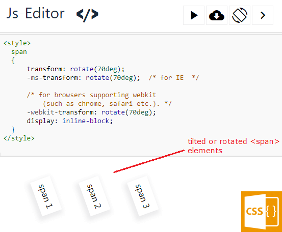
You can tilt or rotate a SPAN or any HTML element at a specified angle using CSS transform property. This property has many useful functions and one of them is the rotate() function, using which you can easily rotate a SPAN element at a given angle, without using any script.
Let’s see an example.
<!DOCTYPE html>
<html>
<head>
<title>Tilt SPAN elements using CSS3</title>
<style>
span {
    transform: rotate(70deg);
    -ms-transform: rotate(70deg);	 /*  for IE  */

    /* 	for browsers supporting webkit (such as chrome, firefox, safari etc.). */
    -webkit-transform: rotate(70deg);
    display: inline-block;
}
</style>
</head>

<body>
    <div>
        <div style='padding: 3%;'>
    	    <span>Nav 1</span>
    	    <span>Nav 2</span>
            <span>Nav 3</span>
        </div>
    </div>
</body>
</html>Look inside the <style> tag where I have used the transform property. The property has the rotate() function, which has a value 70deg (or 70 degrees). Therefore, it will tilt or rotate every <span> element on my web page to a 70-degree angle.
For "IE" browsers, I have used the -ms-transform property. For browsers supporting -webkit (such as Chrome, Firefox, Safari etc.), I have used -webkit-transform.
transform not working in Chrome or Firefox
An important point to keep in mind when using the -webkit-transform property on WebKit-supported browsers: it does not apply to inline elements. Despite being a long-standing issue, it remains unresolved. However, you can easily overcome this by adding display: inline-block; alongside the transform property.
If you have noticed properties inside the <style> tag in the above example, I have use the display property just after -webkit-transform: rotate(70deg);.
/*   for browsers supporting webkit (such as chrome, safari etc.). */
-webkit-transform: rotate(70deg);
display: inline-block;
How to Rotate and Animate SPAN element?
Now that you've mastered rotating and tilting <span> elements using pure CSS, it's time to take things up a notch. You can also animate them effortlessly, adding dynamic effects all without relying on a JavaScript library or script.
I am expanding the above example and I’ll apply some basic animation to the <span> elements to make it look nice.
<!DOCTYPE html>
<html>
<head>
<title>SPAN element Animation using CSS3</title>
<style>
span
{
    transform: rotate(70deg);
    -ms-transform: rotate(70deg);	 /* for IE  */

    /*  for browsers supporting webkit (such as chrome, safari etc.). */
    -webkit-transform: rotate(70deg);
    display: inline-block;

    transition: all 1s;
    -o-transition: all 1s;
    -moz-transition: all 1s;
    -webkit-transition: all 1s;

    cursor: pointer;
}
span:hover {
    transform: translate(3em,0);
    -o-transform: translate(3em,0);
    -moz-transform: translate(3em,0);
    -ms-transform: translate(3em,0);
    -webkit-transform: translate(3em,0);
}
</style>
</head>

<body>
    <div>
        <div style='padding: 3%;'>
            <span>Nav 1</span>
            <span>Nav 2</span>
            <span>Nav 3</span>
        </div>
    </div>
</body>
</html>🚀 Things just got interesting. What started as a basic tilting function for SPAN elements has evolved into a visually captivating CSS effect, adding a dynamic touch to the design.
As I mentioned earlier, the transform property offers a range of useful functions. In the first example, we utilized the rotate() function. Now, in this second example, I've applied the translate() function to achieve a different effect.
Take a look at the pseudo :hover property for the span selector inside the <style> element, where the transform property is combined with the translate() function to introduce dynamic movement.
span:hover {
    transform: translate(2em, 0);
    -o-transform: translate(2em, 0);
    -moz-transform: translate(2em, 0);
    -ms-transform: translate(2em, 0);
    -webkit-transform: translate(2em, 0);
}
This alone would not have given me the desired result. Therefore, I have added the transition property to the span selector.
transition: all 1s;
-o-transition: all 1s;
-moz-transition: all 1s;
-webkit-transition: all 1s;
Experiment with different values to get a desired result. For example,
transform: translate(-10px, -20px);
-o-transform: translate(-10px, -20px);
-moz-transform: translate(-10px, -20px);
-ms-transform: translate(-10px, -20px);
-webkit-transform: translate(-10px, -20px);
Browser Compatibility
• Edge - Yes it worked
• IE 10 - Yes it worked
• Firefox 62+ - Yes it worked
• Chrome - Yes it worked
• Opera - Yes it worked
