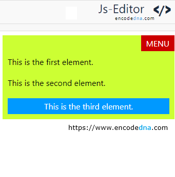
But what if there were a cleaner, more responsive way to achieve the same result, without relying on absolute positioning at all? Enter Flexbox, CSS's modern layout engine that makes top-right alignment not just possible, but effortless. In this follow-up, we’ll explore how Flexbox can replicate and even improve upon the layout, offering better scalability, responsiveness, and control.
➡️ The flexbox property is best described here
Example:
<!DOCTYPE html>
<html>
<head>
  <title>Flexbox Top-Right Menu</title>
  <style>
    * { font-family: 'Segoe UI', sans-serif; }

    .parent {
      display: flex;
      flex-direction: column;
      background: #CCFF33;
      padding: 0;
      height: auto;
      overflow: hidden;
    }

    .top-bar {
      display: flex;
      justify-content: flex-end;
    }

    .menu {
      background: #CC0000;
      color: white;
      padding: 5px 10px;
    }

    .content, p {
      background: #0099FF;
      color: #fff;
      padding: 5px 10px;
      text-align: center;
      width: auto;
      margin: 10px;
    }
    p {
      background: transparent;
      text-align: left;
      color: #000;
      padding: 0;
    }
  </style>
</head>
<body>
  <div class="parent">
    <div class="top-bar">
      <div class="menu">MENU</div>
    </div>

    <p>This is the first element.</p>
    <p>This is the second element.</p>
    <div class="content">This is the third element.</div>
  </div>
</body>
</html>Output:

With Flexbox, there's no need to calculate pixel offset like top: 0 or right: 0.
The MENU element appears neatly in the top-right corner of the layout, thanks to Flexbox. No position: absolute, no float: right, just clean, modern CSS.
