This article is focused on educating beginners who want to understand what complementary colors are, how they work, and how to use them effectively in design.
In this post, we'll explore what complementary colors are, why they work so well, how to use them effectively, and how to easily build your own complementary color palettes using this free Color Palette Generator.

What Are Complementary Colors?
Complementary colors are pairs of hues that sit opposite each other on the color wheel. When placed side by side, they create striking visual contrast; when blended, they neutralize each other into gray or brown.
Here are a few classic complementary pairs:
• Red and Green
• Blue and Orange
• Yellow and Purple
These pairs are not selected at random, they're rooted in color theory. Because they contrast so strongly, complementary colors enhance each other's intensity.
For instance, a bright red next to green (both are complementary colors) appears even more vibrant, making designs pop with energy and balance.
Here's a mental picture.
• Imagine two squares. One bright red, one bright green, placed side by side.
• The red seems redder, and the green seems greener.
• This creates a lively, energetic feeling, which is perfect for designs that need boldness and balance.
Why Complementary Colors Work
Complementary colors work because they engage the eye's natural response to contrast. Our brains seek harmony in color. When we look at one hue, our eyes subconsciously crave its opposite, which creates a visually pleasing balance when both appear together.
This effect is why complementary color schemes are so powerful in design, art, and branding. They can,
1) Draw attention of users to key elements like buttons or calls-to-action
2) Create dynamic and energitic visuals.
3) Offer natural balance and harmony when used thoughtfully.
Tips for Using Complementary Colors Effectively
While complementary colors are visually exciting, using them requires balance. Here are some tips.
1. Use one color as dominant. Let one color take the lead and use its complement as an accent. For example, a deep navy background with orange highlights draws focus without overwhelming the viewer.
Orange Accent
A deep navy background with orange highlights draws focus without overwhelming the viewer.
Its a balanced design. The orange stands out (because orange is navy's complement and it draws focus), while the navy background provides a calm contrast.
2. Adjust saturation and brightness. Pure complements can be intense. Try using softer tints or muted shades to create harmony while maintaining contrast.
3. Add neutrals. Whites, blacks, and grays help tone down the intensity and make designs more polished.
4. Think about context. Colors have meaning. Red and green might evoke holidays, while blue and orange feel sporty or tech oriented. Choose combinations that align with your brand or message.
How to Build Complementary Color Palettes?
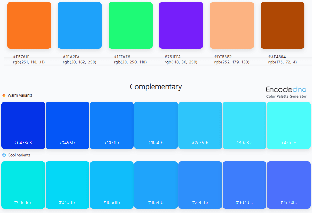
You don't have to guess which colors go together. Our Color Palette Generator make it easy to discover complementary pairs.
Here's how:
1) Go to the tool's page.
2) Enter your base color in HEX.
3) Click "Generate". The tool instantly displays complementary colors and related palettes.
4) Scroll down to see warm and cool variants of complementary colors. Warm/Cool variations are very helpful for balancing UI/UX color harmony and mood control.
5) Copy the color codes for use in your design.
💡 In addition, you can filter and display only the complementary colors that match your selected hue.
This is especially useful for web designers or brand creators who need consistent, professional palettes.
Real World Examples of Complementary Color Schemes
1. Blue and Orange – Modern Energy
Used by brands like Fanta and Firefox, this pairing combines trust (blue) with enthusiasm (orange). A deep navy background with bright orange accents creates bold, professional energy.
Example palettes:
• Navy Blue: #002B5B
• Vibrant Orange: #FF7A00
2. Purple and Yellow – Creative Contrast
This pairing is vibrant yet balanced. Purple exudes creativity and luxury, while yellow adds optimism and warmth, a perfect combination for art, fashion, or lifestyle brands.
Example palettes:
• Rich Purple: #6A0DAD
• Sunny Yellow: #FFD300
3. Red and Green – Bold and Balanced
While often associated with holidays, red and green can work beautifully in non-seasonal contexts when muted. Think deep burgundy paired with olive for an elegant, natural look.
Example palettes:
• Burgundy: #800020
• Olive Green: #556B2F
Conclusion
Complementary colors form the backbone of effective visual design. They bring balance, contrast, and harmony to any creative work, from branding and web design to interior décor and art. Understanding how these color pairs interact allows you to highlight key elements, evoke emotions, and create visuals that appeals everyone.
Next time you start a project, experiment with complementary colors using our Color Palette Generator. Whether you’re exploring bold contrasts or subtle accents, the right complementary palette can completely transform your design's look and feel.
