Here, in this post I’ll show you how to make images responsive to various devices using simple CSS technique. There are many ways to this, however, this approach is simple and works fine on devices, such as, a desktop or any mobile device.
Sighting the popularity of mobile devices and the ability to write single applications for various devices, Ethan Marcotte first defined the term Responsive Web Designing. However, with the recent roll out of a new Mobile Algorithm by the search engine giant Google, RWD or Responsive Web Designing is no longer optional, it is a necessity.
Create a Facebook like Notifications Window using jQuery and CSS
Using CSS “max-width” Property
The most commonly used CSS property to make an Image responsive is the max-width property. You can set the value as 100%. You can do this inline by using the style attribute on each image.
<body>
    <img src="sparrow.jpg"
        style="height:auto;
        max-width:100%;
        border:none;
        display:block;"
        alt="" />
</body>
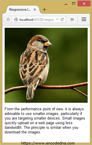
To see how it works, save the file in an HTML format, run the application on a browser, drag the browser sideways to make it small. The image will fit itself depending upon the size of the browser window.

The actual size of this image is 500px width and 452px height. On a desktop browser, it will show the real size of the image. However, on a smaller device it would adjust accordingly.
Simplest way to add a "transparent" text over image using CSS
Apply “max-width” Property on Multiple Images using CSS Class
Usually, we have multiple images on a web page or in our application. We either add the images manually or dynamically using Asp.Net or any other technology. Its quite obvious that you will want all the image to be responsive. The simplest way to do this is by creating a CSS class, which will apply the max-width property to all the images.
<!DOCTYPE html>
<html>
<head>
    <title>Responsive Image using CSS</title>
    <style>
        img.alldevices{
            margin: 0 auto;
            height: auto;
            max-width: 100%;
            border: none;
            display: block;
            padding: 5px 0;
        }
    </style>
</head>
<body>
    <p>Restore down the browser window and drag the browser sideways to make it small and big.
        It will automatically adjust the images according to the width and height of the browser window.</p>

    <div>
        <img src="../../responsive/responsive-image.png" class="alldevices" alt="sparrow" />
        <img src="../../jquery/demo/MOTORSPORT.jpg" class="alldevices" alt="car" />
    </div>
</body>
</html>
You can test the above code here. (Simply copy the code and paste it in the editor and click Run.)
🙂
