Last updated: 02-01-2023
The HTML <input> is one of the most important form elements, with many useful features that help us to collect information on a webpage. Later, HTML5 introduced some new input types and attributes that make the input element more dynamic and useful and here in this article we will discuss about HTML5 Input Types and Attributes.The most interesting feature that comes to my mind as a developer, is the automatic input validations while submitting the form. It will spare the developer from writing lengthy scripts for input validations, and in the process, will save precious development time. So, let us find out how we are going to use these new input types and its attributes on our web pages and benefit from it.
New Input Types and Attributes
1) Input Type "number"
Usually, the default type of an input element is text. Every browser understands this element even when we declare the element using just the tag.
<input />
If we add the above tag on our webpage without mentioning type, it will behave like an input box. HTML5 has introduced the type number, specifically to accept numerical values (+ve and -ve values). At first sight, it looks like an ordinary text box. However, when we set focus on the input box (or hover over the box), you will see that it is a spinner.
Note: Wrap the input element inside the <form> tag to get the desired result.
<form method="get" action="">
    Choose a number <br />
        <input type="number" name="number-game" />
</form>
A spinner control allows users to select values by clicking or holding the up or down arrow.
image
Browser Support:
Chrome - Yes | Edge - Yes | FireFox - Yes
2) Input Attributes "min and max"
I am using the above (1st) example understand min and max attributes.
While input type "number" will allow you to choose numbers (positive or negative number), you can limit or set a range. For example, we want our users to choose or enter numbers between 5 and 15, all positive numbers. However, if they mistaken or intentionally enter a value, which is less or more than the specified range, it will show a message and will not accept further commands.
<form method="get" action="">
    Choose numbers between 5 and 15

    <input type="number" min="5" max="15" />
    <input type="submit" value="Submit" />
</form>image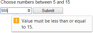
Browser Support:
Chrome - Yes | Edge - Yes | FireFox - Yes | Internet Explorer 10 - Yes
3) Input Attribute "step"
Here is another interesting input attribute called the step. The step attribute restricts values based on number intervals. Therefore, if you set the step value as "2", then your users can select value such as 2, 4, 6 or -2, -4, -6 etc.
<form method="get" action="">
    <input type="number" step="2" min="2" max="10" />
</form>
In the above example, we are restricting negative values as well as set a limit between 2 and 10.
Browser Support:
Chrome - Yes | Edge - Yes | FireFox - Yes
4) Input Attribute "required"
The required attribute is of type Boolean, which means it accepts values such as true or false. The default value is true. Use this attribute with the input box, if you wish to force your users to enter some value in the input box.
Note: We are not 100% sure, if this is a foolproof solution for a mandatory field.
<form method="get" action="">
    Please enter you name <br />
        <input type="text" required />
        <input type="submit" value="Submit" />
</form>
Browser Support:
Chrome - Yes | Edge - Yes | FireFox - Yes
5) Input Type "email"
Input type email allows users to enter one or more valid email addresses. Yes, a valid one, since it will verify the email address for characters like "@", ".com" etc. Though, it spares the web developer for writing scripts to validate the email address, it is always advisable to write a scripts at the client as well as at the server side to double check the entered email address.
<form method="get" action="">
    Enter email address
        <input type="email" name="comp-email" />
        <input type="submit" value="Submit" />
</form>
You can add more attributes to this type to make it useful. Such as, adding attribute "multiple" will allow your users add one than one email address in the field.
Browser Support:
Chrome - Yes | Edge - Yes | FireFox - Yes
6) Input Attribute "multiple"
The multiple attribute is of type Boolean and it take a true or false. If we add this attribute with the type email and set its value as "true", then we can add more than one email addresses. However, you can use the multiple attribute with other Input Types also, such as a file type.
<form method="get" action="">
    <input type="email" multiple="true" />
    OR
    <input type="file" multiple="true" />
</form>
Browser Support:
Chrome - Yes | Edge - Yes | FireFox - Yes
7) Input Attribute "placeholder"
The placeholder attribute shows a small message inside the input box, describing the type of value the user must enter. This attribute has many advantages. If you are a web developer, then you do not have to add an extra label to show messages, it saves space on the web page. From a user’s point of view, a single glance at the input field the user gets a clear message about the field and the expected value.
For example, we have an input box, and the character limit is set to 5.
<form method="get" action="">
    <input type="text" maxlength="5" placeholder="Five char limit" name="city-code" />
</form>
The maxlength is set to 5 and the placeholder clearly has a message for the user, which spares them from guessing.
Browser Support:
Chrome - Yes | Edge - Yes | FireFox - Yes
8) Input Attribute "list"
The list attribute will allow you to add an AutoComplete feature to an input box. We usually attach a datalist element with the list attribute using the attribute’s id.
<form method="get" action="">
    List of Books <input type="text" list="books">

    <datalist id="books">
        <option value="Asp.Net 4 Blue Book" label="Asp.Net">
        <option value="Teaching Science" label="Science">
        <option value="Circuit Bending" label="Electical">
    </datalist>
</form>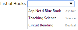
Browser Support:
Chrome - Yes | Edge - Yes | FireFox - Yes
9) Input Attribute "pattern"
We can now specify regular expressions to restrict user input, by adding the pattern attribute. For example, we want our users to enter only five alphabets in lower case, our pattern would be,
<form method="get" action="">
    <input type="text" pattern="[a-z]{5}" name="short-name" />
</form>
No special characters, no space, just five alphabets. You can add the pattern attribute with type email, text (in our example), tel, password, url and search.
Browser Support:
Chrome - Yes | Edge - Yes | FireFox - Yes
10) Input Type "url"
The input type url accepts the web address as a value. The web address is the address of a website, which we type in the browsers address bar. You can enter a single or multiple addresses in the input box of type url. To allow users to enter more than one url, you need to add the multiple attribute with the url type.
<form method="get" action="">
    <input type="url" name="url" multiple="true" />
</form>
While submitting the form, it will check for an authentic url value, else it will show a message.
Browser Support:
Chrome - Yes | Edge - Yes | FireFox - Yes
11) Input Type "tel"
This is one input type designed exclusively for smart phones, but not for regular browsers. Add this type on the web page and check it on a smart phone. When focus is set on the field (with type tel), the mobile browser shows a phone keypad for entering phone numbers. A phone keypad usually has numbers and "+" sign.
<form method="get" action="">
    <input type="tel" name="telephone" />
</form>
However, we have checked type tel on a regular browser, we did not see any visible difference between Input Type tel and text.
Do not forget to add the required attribute, if you think it is necessary for your users to add the phone number. It will definitely check for the number, at least.
12) Input Type "date"
The type date will allow us select a date from a Datepicker control. Before HTML5, web developers would usually add two different controls, an input box and Datepicker, to accomplish this task. However, HTML5 date type has simplified this process.
<form method="get" action="">
    <input type="date" name="joining-date" />
    <input type="submit" value="Submit" />
</form>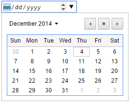
When you first load the page, the input box with type date, will show the date format mm/dd/yyyy in the box. Set focus on the element (or hover the mouse over the element), it will show a spinner and a drop down icon at the right corner of the element. To choose the desired date either you need to click the spinner buttons, up or down arrow, or simple click the drop down icon to view the Datepicker.
You can show a default value in the input box instead of the format. All you have to do is, add the value attribute to the element.
<form method="get" action="">
    <input type="date" value="2014-12-04" name="joining-date" />
</form>
Browser Support:
Chrome - Yes | Edge - Yes | FireFox - Yes
13) Input Type "datetime-local"
It lets user to enter (or select) both date and time.
<form method="get" action="">
    <input type="datetime-local" id="dtime" />
</form>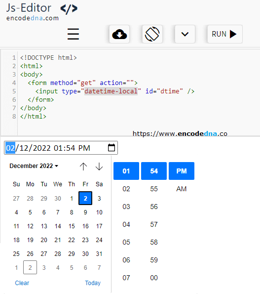
Browser Support:
Chrome - Yes | Edge - Yes | FireFox - Yes
14) Input Type "week"
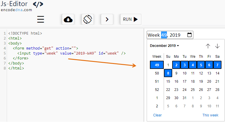
Works fine with Chrome and Edge browsers. This input type will allow users to select and display week of a selected month. The input box has a spinner and drop down control to choose the week from a Datepicker.
<form method="get" action="">
    <input type="week" value="2019-W49" id="week" />
</form>
The above value displays 49th week for the year 2019.
Browser Support:
Chrome - Yes | Edge - Yes | FireFox - No
15) Input Type "month"
The type month will show a selected month and year. As usual, it looks and works like a Datepicker, which we have seen above.
<form method="get" action="">
    <input type="month" name="month" />
</form>
This is how you add the type to the input box. You can also set a default value with the type.
<input type="month" value="2019-12" />
Browser Support:
Chrome - Yes | Edge - Yes | FireFox - No
16) Input Type "time"
The type time allows users to select time (digital) using a spinner control. Many browsers still do not support this type. Works fine with latest versions of Chrome and Edge.
<form method="get" action="">
    <input type="time" name="nop" />
</form>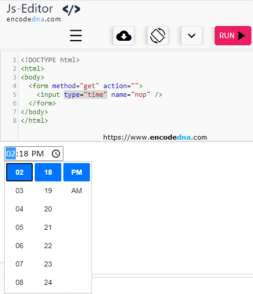
When we add the above tag, it shows an input box with hyphens and colon. However, you can add default values. For example, we want to show the time 12:51 pm then add this value.
<input type="time" value="12:51" />If you want to show the time as "12:51:20 am", then the values look like this.
<input type="time" value="00:51:20" />Browser Support:
Chrome - Yes | Edge - Yes | FireFox - No
17) Input Type "color"
The type color allows users to choose colours from a colour Picker control. The default colour is Black. When you first load the input type on the browser, it shows the color black. We can use a HEX code to define the color of our choice.
<form method="get" action="">
    <input type="color" name="color-me" />
</form>
Add a Hex code value along with the type.
<input type="color" value="#CCCCCC" />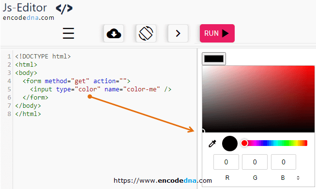
Browser Support:
Chrome - Yes | Edge - Yes | FireFox - Yes
18) HTML5 Input Type "search"
The basic use of this type is to add a search box on a web page. Just adding the type does not ensure a search, you have to write some script at the client side or at the server side.
<input type="search" />19) Input Type "range"
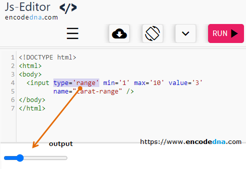
The type range is the most useful type designed by HTML5. This is my personal opinion. It shows a slider control on the web page, which you can slide from least value to max value. Designing a slider would require lots of scripting in previous versions of HTML. However, now we have a readymade control, which is easy to use and simple to make it function.
<input type="range" name="carat-range" />Since its a range, it must have a minimum value and maximum value. For this, we will add the min and max attribute with the type range.
<input type="range" min="1" max="10" value="3" name="carat-range" />
So now, the range has a min value of 1 and max value of 10. Its default value is 3.
Browser Support:
Chrome - Yes | Edge - Yes | FireFox 34.0 - Yes | Internet Explorer 10 - Yes
